Jump To:
Webinar OverviewAccessing Range Calc
Range Calc Layout
Colors! What Do They Mean?
Common Range Calc Spikes
Ordinary Income Graph:
- 18.5% - Purple (Social Security)
- 22.2% - Purple (Social Security)
- 27.0% - Red (0% to 15% Long-Term Capital Gains Rate)
- 23.3% - Teal (Phaseout of Enhanced Senior Deduction)
- 27.8% - Brown (Net Investment Income Tax - NIIT)
- BONUS: Why adding more income may lower the effective rate on the next $1,000
- BONUS: Roth Conversion Effective Rate Explained
Capital Gains Graph:
- 8.5% - Purple (Social Security)
- 12.0% - Light Blue (Using up Allowable $3,000 Capital Loss)
- 15.0% - Red (Long-Term Capital Gains - LTCG)
- 16.6% - Teal (Phaseout of Enhanced Senior Deduction)
- 18.8% - Brown (Net Investment Income Tax - NIIT)
Advanced Settings
Check out our webinar below, where we go deeper on how to use Range Calc, and how to interpret the analysis from the Range Calc graphs!
Accessing Range Calc:
To access Range Calc, click on the ellipsis (three dots) to the right of any editable scenario title, and you will be taken to a new screen that illustrates the tax impact of the next $1,000, both for Ordinary Income and, separately, for Long-Term Capital Gains.
Range Calc Layout
The $0 value on the horizontal axis represents not $0 of taxable income, but the taxable income of the given scenario being analyzed. Moving to the right of the $0 point is the equivalent of adding ordinary income or qualified income (depending on which graph within Range Calc you are looking at) to the baseline. Below is an outline of some of the key controls within Range Calc and what each of them does.
- Last step before next jub in Effective Tax Rate: Outlined in teal, this value will match the "Effective Tax on Next $1,000 Ordinary Income" and "Effective Tax on Next $1,000 Capital Gains" items in Scenario Analysis. This value will also be similar to the values in the Solve for Min/Max tool, with the caveat that the default Step Width in Range Calc is $1,000, and the default interval in Solve for Min/Max is $500.
- Baseline Income Figures: Outlined in black, this figure represents the baseline taxable income, and depending on whether you're looking at the Ordinary Income Graph or Capital Gains Graph, the taxable ordinary income, LT gains, and Qualified Dividends from the scenario on which the Range Calc Tool is deployed. Since Range Calc references a particular scenario, each Range Calc graph is associated with that particular scenario.
- Range Low End - Outlined in blue, this point serves as the origin of the x-axis on your graph. Reset this number by clicking on the "Rewind" button circled in blue. This will return the figure for the low end range of the graph to be equal to negative taxable income minus $10,000. This ability to enter a negative value is highlighted as well in the note outlined in orange beneath the graph.
- Range High End - Outlined in red, this sets the far range of the x-axis on the graph.
- Step Width - outlined in green, this is the step interval of additional income (set to $1,000 by default) along the x-axis.
- Update Chart/Summary Chart - Select Update Chart to reflect changes to the range bounds and step width. Click on the Summary Chart button to access a chart of the effective rates for various amounts of income.
- What Does It Mean? - Outlined in yellow, this tab provides context on what some of the more common spikes in Range Calc depict.
- Medicare IRMAA (Income Related Monthly Adjustment Amount) Thresholds - The vertical dotted lines outlined in pink above represent the MAGI (Modified Adjusted Gross Income) thresholds at which a client will cross into the next IRMAA threshold. The value indicated as a label on these dotted lines represents the annual increase per person for Medicare Part B/D Premiums beyond the base Medicare Part B/D premiums.
Firm Admins can customize the default behavior for those IRMAA lines to show up for all clients, no clients, or only for clients age 63 or older, when income first impacts those potential IRMAA surcharges, by navigating to Settings > Features & Tools, and then to the Tax sub-menu on the left navigation menu options. Scroll down to the Medicare Parts B and D Behavior section seen below, and make the adjustments as desired to that default behavior.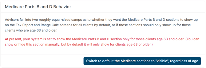
- Graph Key/Legend: Outlined in gray, this key lets you know which colors are associated with which tax components in the Range Calc graph. While the attribution of the colors can vary based on how many components are involved, the black "Total Federal Tax Impact" line depicts the total impact of the various components.
- Negative Values in Range Low End: A note outlined in orange reminds you that you can enter a negative value in the "Range Low End" field to show the impacts not of adding additional income, but taking away income from the current scenario. Negative values will result in the x-axis starting not at $0, but instead at the negative value entered.
Colors! What Do They Mean?
The key to understanding Range Calc is that you’re looking at the effective marginal rate of adding $1,000. If there is no change in the effective rate, you’ll see a flat line.
Range Calc will also illustrate the attribution of the total tax rate using a color coding system. Depending on the scenario in question, the Range Calc chart may include some combination of the following:
- Black Line - Total Federal tax impact
- Light blue - Taxes on ordinary income (i.e., marginal brackets)
- Red - Taxes on long-term capital gains and qualified dividends
- Brown - Net Investment Income Tax (NIIT)
- Purple - Social Security becoming taxable
- Teal - Phaseout of enhanced senior deduction
- Gray/black - Refundable child tax credit phase-out
- Green - Credit phase-ins
- Light purple - Qualified Business Income Deduction (QBID) phaseout
- Violet - Non-refundable child tax credit phase-out
For a refresher on what each of these colors means and more details about why they appear (or disappear), check out the teal What Does it Mean? tab on the right side of the screen in Range Calc.
Though they are not a tax, users can see the impact of additional income on any IRMAA (Income Related Monthly Adjustment Amount) surcharges on Medicare Part B and Part D premiums as indicated by the vertical, gray, dashed lines outlined in pink in the screenshot above.
Common Range Calc Spikes
Here are some quick 3-5 minute videos where we cover some of the more commonly seen spikes within Range Calc, both in the Ordinary Income graph and Capital Gains graph.
Ordinary Income Graph:
- 18.5% - Purple (Social Security) - 10% (Ordinary Income) + 8.5% (Social Security)
- 22.2% - Purple (Social Security) - 12% (Ordinary Income) + 10.2% (Social Security)
- 27.0%- Red (0% to 15% LTCG Rate) - 12% (Ordinary Income) + 15% (LTCG)
- 23.3% - Teal (Phaseout of Enhanced Sr. Ded.) - 22% (Ordinary Income) + 1.3% Enhanced Senior Deduction phaseout
- 27.8% - Brown (Net Investment Income Tax - NIIT) - 24% (Ordinary Income) + 3.8% (NIIT)
- BONUS - Why adding more income may lower the effective rate on the next $1,000
- BONUS - Roth Conversion Effective Rate Explained
Capital Gains Graph:
-
8.5% - Purple (Social Security)
-
12.0% - Light Blue (Using up Allowable $3,000 Capital Loss)
- 15.0% - Red (Long-Term Capital Gains - LTCG)
- 16.6% - Teal (Phaseout of Enhanced Senior Deduction)
- 18.8% - Brown (Net Investment Income Tax - NIIT)
Advanced Settings:
Click on the Advanced Settings link, located at the top-right of the Range Calc screen.
Here, users can select the type of income - Ordinary Income & Capital gains, Incentive Stock Options, or the Marginal/Total Tax Rate. Check/uncheck the box to make the Medicare IRMAA Part B/D Annual Increase lines visible or not, and check the box to add the state tax impact on top of the federal impact as income is added.