![Holistiplan Logo (800x200 px).webp]](https://help.holistiplan.com/hs-fs/hubfs/Holistiplan%20Logo%20(800x200%20px).webp?width=160&height=40&name=Holistiplan%20Logo%20(800x200%20px).webp)
The Protection Snapshot is a tab within the P&C Insurance report that turns policy data into a visual conversation starter. Instead of reviewing raw numbers on the Policy Analysis tab, you and your client can see two charts, one for property coverage, one for liability coverage, each showing how the current insurance picture compares to the financial plan.
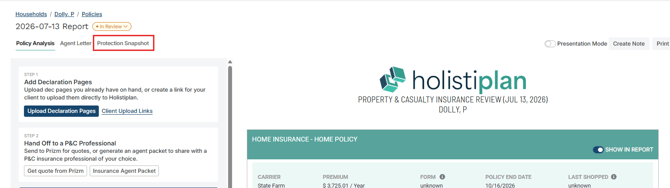
The tab auto-populates from data already in the report. You don't enter anything new here. If the data is in place on the Policy Analysis tab, the charts build themselves.
WHAT THIS TAB IS FOR
The Protection Snapshot is a client conversation tool. Use it to show a client where their coverage stands relative to what they own and what they could owe. It is not an insurance assessment and does not tell clients what to do; it gives you a clear visual to anchor the discussion.
The Two Charts
Property Chart — Dwelling Limit vs. Replacement Cost
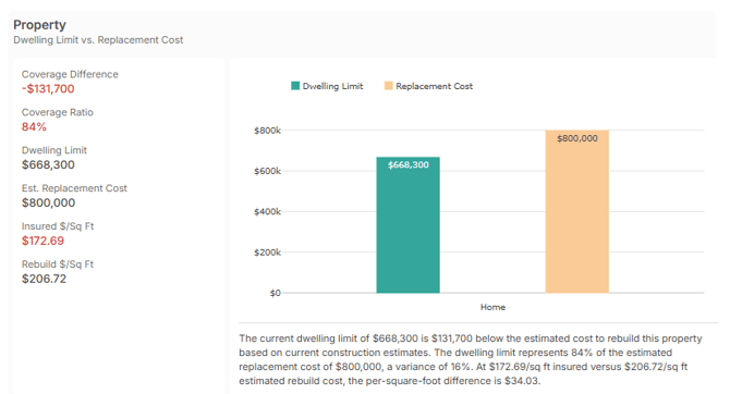
This chart compares the dwelling limit listed on the declaration for each home or landlord policy to an estimated replacement cost for that property. It answers the question: if this property were destroyed, would the insurance payout cover the cost to rebuild it?
A separate chart renders for each home or landlord policy on file. The replacement cost comes from a Cotality (CoreLogic) estimate if one is available for the address, or from a manually entered rebuild cost estimate you've added on the Policy Analysis tab.
Liability Chart — At-Risk Assets vs. Total Liability Coverage
This chart compares total liability coverage to the household's at-risk asset value, the portion of household assets that could be reached in a liability judgment. It answers the question: if a significant liability claim exceeded the underlying policy limits, is the umbrella large enough to cover the household's exposure?
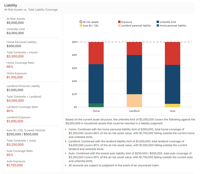
The chart shows up to three bars side by side, one for home exposure, one for landlord exposure, and one for auto exposure, each calculated independently. Each bar stacks the underlying policy limit and the umbrella limit together and compares the total against the at-risk asset value.
The at-risk asset value is entered on the Policy Analysis tab within the umbrella policy section. It represents the household assets that aren't fully protected by retirement account exemptions, homestead protections, or entity structures. You set this number; Holistiplan displays it as entered.
Reading the Color States
Both charts use color in the left panel metrics to signal coverage alignment at a glance. Here's what each color means:
Property Chart
| h |
Green — Aligned When you see it: Dwelling limit meets or exceeds the estimated replacement cost. What it means: Coverage appears aligned with current construction cost estimates for this property. |
|
Amber — Within range When you see it: Dwelling limit is between 80–99% of the estimated replacement cost. What it means: Most carriers require 100% coverage. Some permit a minimum of 80%. The policy is within the permitted range but below the standard most carriers require. |
|
|
Red — Gap When you see it: Dwelling limit is below 80% of the estimated replacement cost. What it means: The dwelling limit may fall short of what carriers require and may not cover a full rebuild at current costs. |
|
Green — Covered When you see it: Total coverage (umbrella + underlying limit) meets or exceeds the at-risk asset value for that exposure type. What it means: Based on the at-risk asset value on file, that exposure type appears covered by the current policy limits. |
|
|
Red — Gap When you see it: Total coverage falls short of the at-risk asset value for that exposure type. What it means: Assets that could be reached in a liability judgment exceed the current coverage for that exposure type. |
How to Use the Protection Snapshot
-
Make sure the data is in place on the Policy Analysis tab
The Protection Snapshot reads from the Policy Analysis tab. Before opening the Snapshot, confirm that declaration pages are uploaded, OCR has processed them, and the rebuild cost estimator along with at-risk asset value is entered. If any of these are missing, the relevant chart section will prompt you with what to add and where.
-
Open the Protection Snapshot tab
Select the Protection Snapshot tab from the tab navigation within the P&C Insurance report. The charts build automatically from the data on file. If a chart section shows an incomplete data notice, follow the prompt to add the missing data on the Policy Analysis tab.
-
Review the charts before a client meeting
Look at the color states in the left panel for each chart. Red or amber on the property chart means the dwelling limit may not fully cover a rebuild. Red on the liability chart means at least one exposure type has assets outside the current coverage limits. Use these as your conversation anchors.
-
Print or present
Use the Print button to generate a PDF for the client, or enter Presentation Mode to display the report full-screen during a meeting or screen share. Notices and advisor UI controls do not appear in either output, only the charts and any visible insight copy.
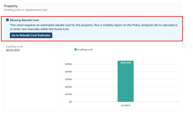
If a chart section shows a notice instead of a chart, it means data needed to build that section is missing. Each notice tells you exactly what's missing and where to add it. Here's a quick guide:
|
Notice |
What's missing |
What to do |
|---|---|---|
|
No data yet |
No policies of any type uploaded for this household |
Upload declaration pages on the Policy Analysis tab |
|
Missing Home Policy |
No home policy uploaded |
Upload the home policy declaration page on the Policy Analysis tab |
|
Missing Umbrella Policy |
No umbrella policy uploaded |
Upload the umbrella policy declaration page on the Policy Analysis tab |
|
Insufficient Data — Missing Rebuild Cost |
Home or landlord policy uploaded but no rebuild cost limit completed. |
Run a Cotality estimate or enter a manual rebuild cost using the home icon on the Policy Analysis tab |
|
Insufficient Data — Missing At-Risk Assets |
Umbrella policy uploaded but at-risk asset value not entered |
Enter the at-risk asset value using the umbrella icon on the Policy Analysis tab |
|
Chart Not Applicable |
A renters policy is on file; renters coverage does not include a dwelling limit within our report. |
No action needed. Renters policies are intended to cover personal property and liability, not the structure itself. |
|
Document Review Failed |
An uploaded policy document did not pass OCR review |
Re-upload a clearer version of the declaration page on the Policy Analysis tab |
Frequently Asked Questions
Do I need to enter data on the Protection Snapshot tab?
No. The Protection Snapshot tab is read-only. All data comes from the Policy Analysis tab. If a chart isn't rendering, the fix is always on the Policy Analysis tab, not the Snapshot tab.
Why does the property chart show amber instead of red even though the dwelling limit is below 100%?
Amber means the dwelling limit is between 80–99% of the estimated replacement cost. Most carriers require 100% coverage, but some permit a minimum of 80%. Amber signals the policy is within the permitted range but below the standard most carriers require. Below 80% triggers red.
What is the at-risk asset value and how do I know what number to use?
The at-risk asset value is your assessment of the household assets that could be reached in a liability judgment, what's left after retirement accounts, homestead exemptions, and entity protections are excluded. This is a professional judgment call on your part. Holistiplan displays whatever value you enter. If you're unsure how to calculate it, consider coordinating with the household's attorney or CPA.
The liability chart shows three bars. What are they?
Each bar represents a different exposure type: home, landlord, and auto. Each bar calculates independently: umbrella limit plus the underlying limit for that policy type, compared against the at-risk asset value. A household without a landlord policy will only see home and auto bars. A household without an auto policy will only see home and landlord bars.
Why does the liability chart show a percentage for some bars and not others?
When total coverage for a bar is below the at-risk asset value, the chart shows the coverage percentage so you can see how large the gap is. When total coverage meets or exceeds the at-risk value, the percentage is suppressed and the chart simply confirms coverage.
What does the asterisk (*) next to a left panel metric mean?
An asterisk means multiple policies of that type are on file, and they have different underlying limits. The chart uses the lowest limit to show the most conservative picture. The asterisk note below the insight copy identifies which policy types are affected and points you to the full P&C report for the individual policy details.
The replacement cost number looks off. Where does it come from, and can I change it?
The replacement cost is sourced from Cotality (CoreLogic) data if a Cotality estimate has been run for the property address. If no Cotality estimate is available, or if you want to override it, you can enter a manual rebuild cost estimate using the home icon on the Policy Analysis tab. A manually entered value always takes priority over the Cotality estimate.
Will the Protection Snapshot appear on client-facing reports I'm already sharing?
The Protection Snapshot is a tab within the P&C Insurance report. It does not automatically appear in any existing output. You choose whether to print it or present it. Your existing P&C report workflow is not affected unless you actively navigate to the Snapshot tab and generate output from it.
A chart section is showing a notice but I've already uploaded the policy. What's happening?
A notice can appear even with a policy uploaded if the uploaded document didn't include a specific required field, for example, a dwelling limit or a rebuild cost estimate. It can also appear if the document failed OCR review. Check the notice text for specifics, then go to the Policy Analysis tab to either add the missing data manually or re-upload a clearer document.